Samuel & Sons' Paris showroom will be closed on Thursday, May 14th and Friday, May 15th.
Samuel & Sons' Paris showroom will be closed on Thursday, May 14th and Friday, May 15th.
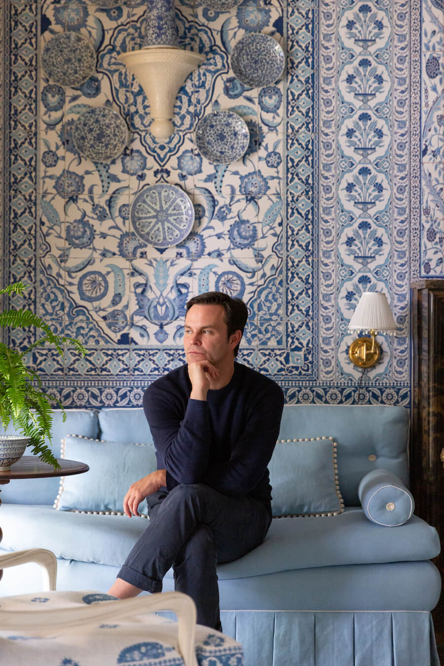
We caught up with designer Mark D. Sikes on the heels of his participation in the inaugural Kips Bay Show House in Dallas and the release of his second book More Beautiful. We talked trim applications, of course, with a side of classic films, friends and mentors.
Following the Q&A you'll find photos from his Kips Bay living room he called Casa Fiorentina, "a Texas twist on the iconic La Fiorentina."
Q: What was your first interior design-minded memory, something that you look back on and realize that your perception, a unique consciousness of your surroundings, was perhaps a foreshadowing of your chosen path?
A: As a child I loved all the Estée Lauder campaigns I saw in magazines. They were shot by Victor Skrebneski and always featured beautiful models in chic clothes in these gorgeous rooms. I loved the intersection of seeing fashion within a beautiful interior setting.
Q. Was there someone who encouraged you or helped to find your way into the industry or an experience that helped to form your individual vision of traditional American design?
A. Bunny Williams has always been a friend and mentor in the industry. She is the Grand Dame of All-American design. She’s everything- talented, but also so kind. She makes everyone feel important when she’s talking to them. The first time we met was at a blog conference, and we’ve been friends ever since.
Q. We’ve seen Grace Kelly appear time and again among your mood boards and social posts—what films, classic or modern-day, boast style (fashion and/or interior design) that hold a special place in your heart and continue to inspire your work.
A. Out of Africa is my all-time favorite movie. I go back to it for inspiration time and time again. There’s a whole chapter dedicated to its natural aesthetic in my first book, Beautiful. I love the chic but casual clothes the actors wear, the interiors of the spaces, and the whole feel of the movie with its layered, natural landscape, colors, and textures.
Q. Much like your newest title, More Beautiful, your design for the inaugural Kips Bay Dallas Show House was laden with “heady doses of trim.” When in your design process does trim typically come into play and what were some of the more unique applications seen within the walls of your La Fiorentina-inspired living room?
A. Trim is always at the forefront of my mind as I’m designing. Just as I think about fabric points of view I think about trim points of view whether I’m going for a simple and clean look or a more formal or layered look. For Kips Bay, we wanted the room to feel not only elegant but also comfortable, so we relied heavily on the cotton trimmings within the Bali collection for their unique yet casual feel.
Q. Over the years, we’ve witnessed bold applications, recalling large-scale borders or bullions, but equally important and a staple in your designs are trimming basics. We see them throughout, quietly taking their places among patterns and plains, and making a significant difference all the same. Do you have any go-to favorites within the repertoire of basic trimmings?
A. We always use French Piping for lampshades, and I love Flanders for a simple tape trim. The possibilities of what you can do with just those two collections are endless!
2020 Kips Bay Dallas Show House
Living Room by Mark D. Sikes
Photos by Stephen Karlisch
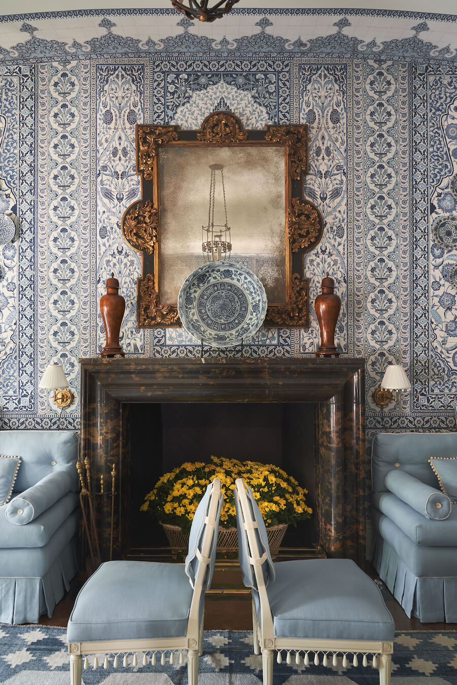
Seychelles Wood Teardrop Fringe (chairs) and Harbour Beaded Braid (pillows)
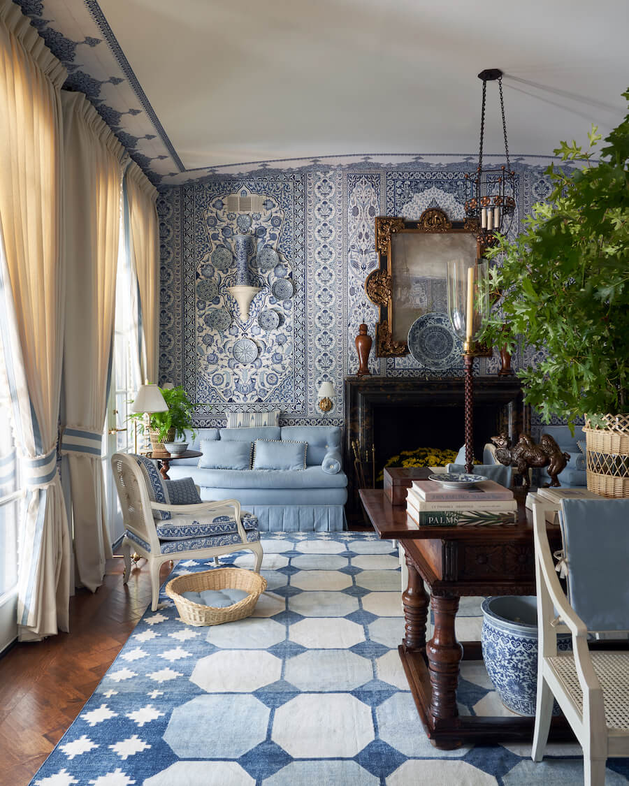
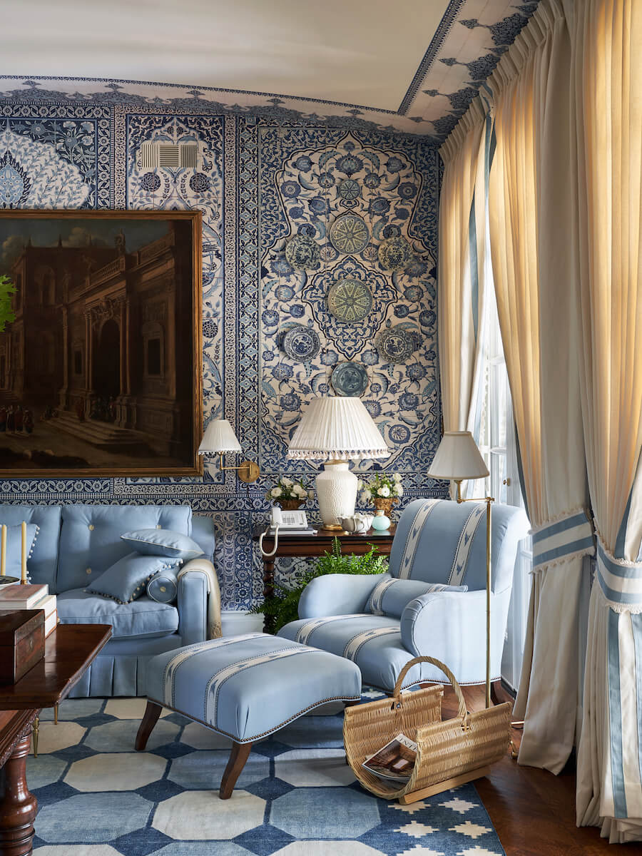
Flanders Border and Bali Cotton Fan Edge (draperies, fabricated by The Shade Store), Annecy Gimp (chair and ottoman), Semi Custom Le Jardin Linen Tufts (sofa), Bali Knotted Cotton Tassel Fringe (lamp)
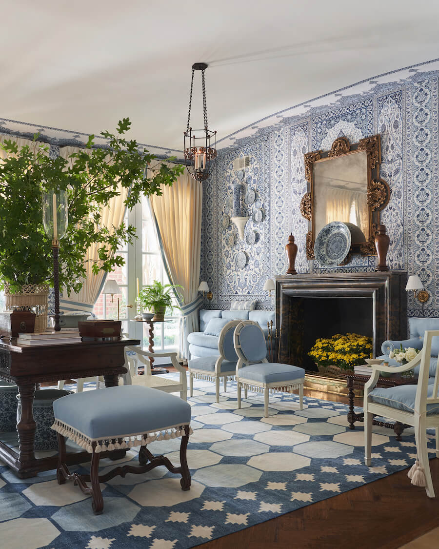
Bali Cotton Tassel Fringe (ottoman)
For more of Mark's classic American style and inventive trim applications—a must-have for your design library—order a copy of his newest book, More Beautiful.
Subscribe to our newsletter to be the first to join us as we unlock the door to our latest collaboration on January 17th.