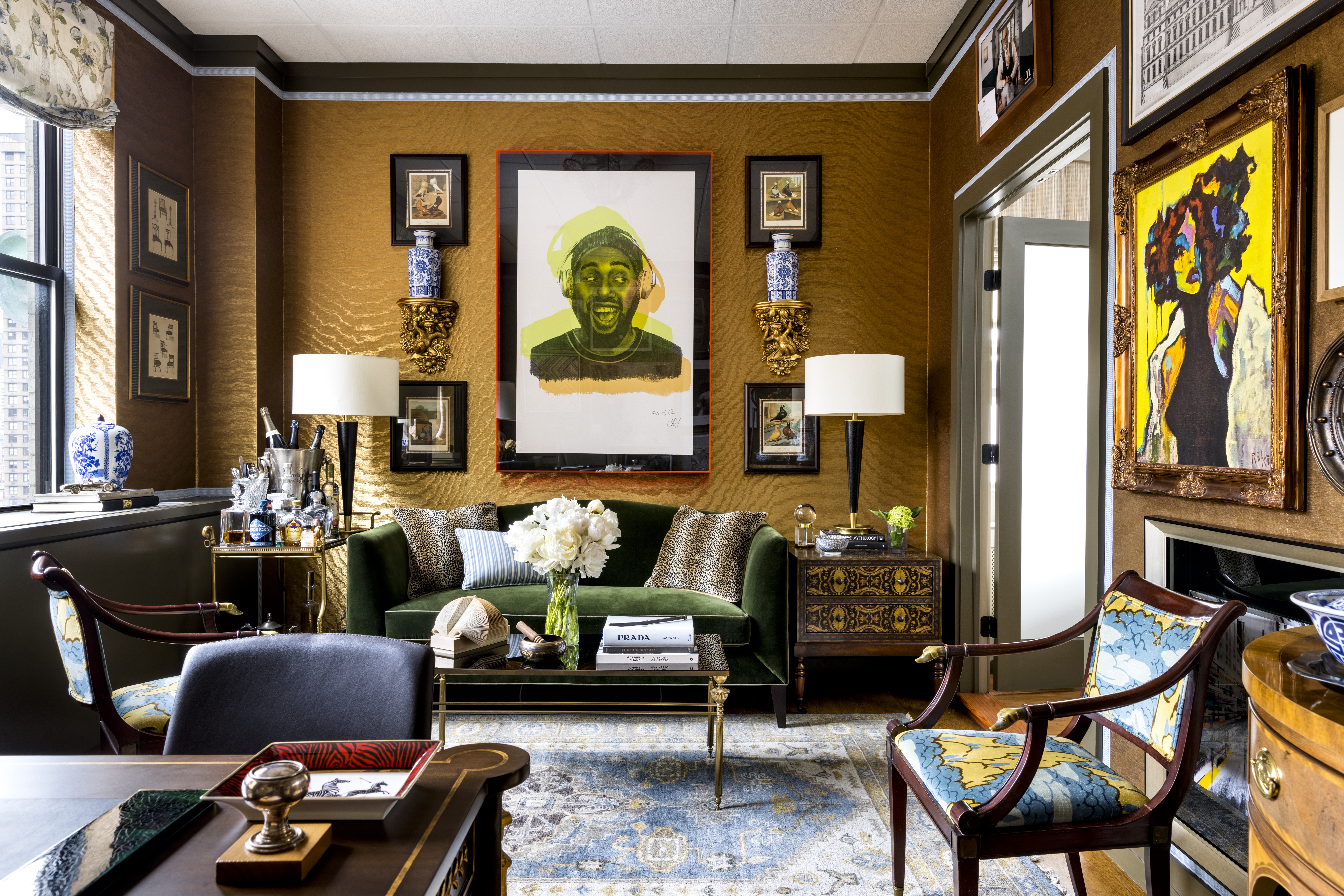
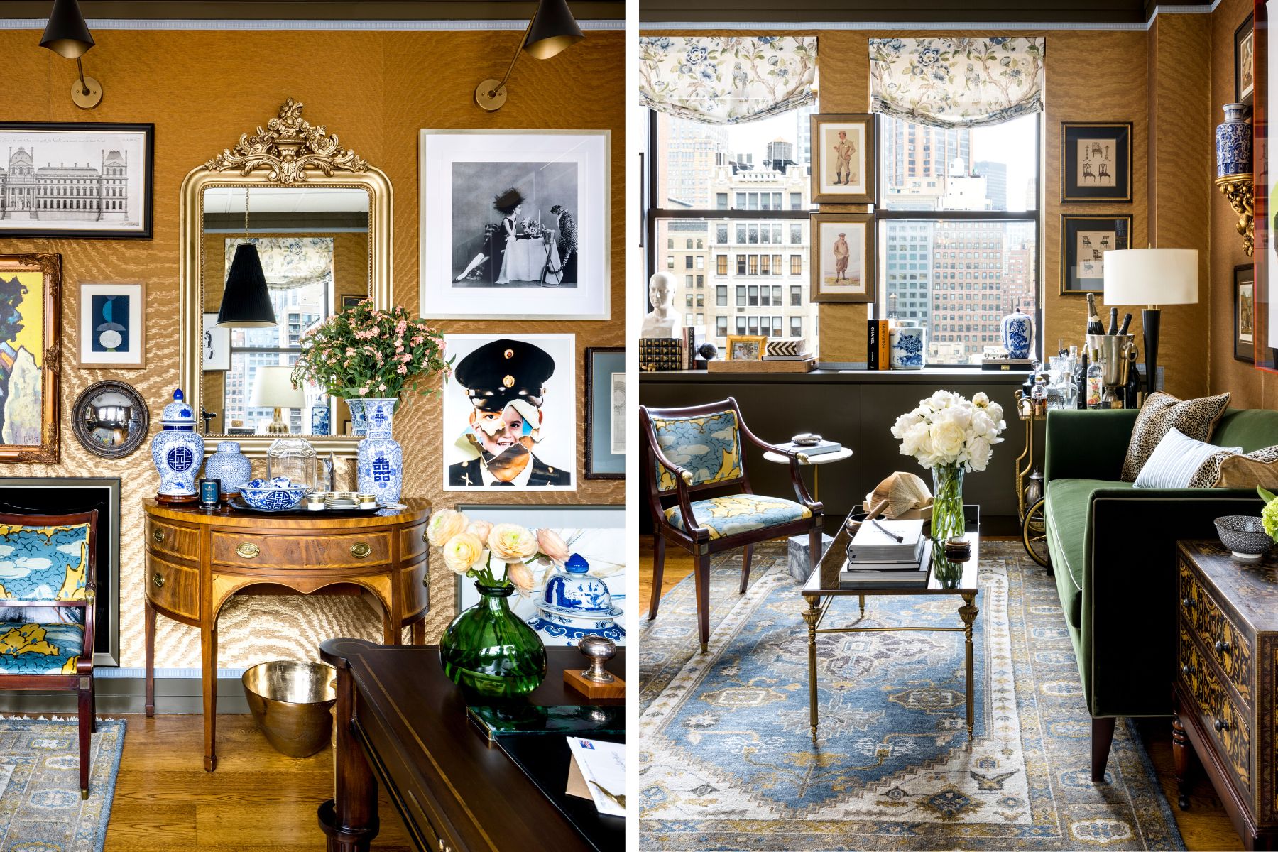
We spoke with designer Corey Damen Jenkins about his new office in New York City and how he created a welcoming space filled with his signature maximalist style.
Samuel & Sons: What was your approach to designing your new office space?
Corey Damen Jenkins: It was very important to me that our studio was a literal testament to the type of work that we do, and the level of luxury we strive to create for our residential and hospitality client projects. So, while our studio is primarily a laboratory for work and business meetings, I wanted every chamber to feel finished, elegant and inviting to our staff, clients, and guests.
S&S: The office has such a warm and welcoming feel. How did you achieve this?
CDJ: The space offered certain assets from an architectural standpoint--the 17-foot ceilings packed with glass skylights naturally brought an ethereal effect to the studio and front hall areas. The color palette of olive, cornflower, gold, white, and emerald green did the rest. We also have a lot of antiques and vintage furnishings and artworks layered in the mix, which is not always something you see in white-box office spaces.

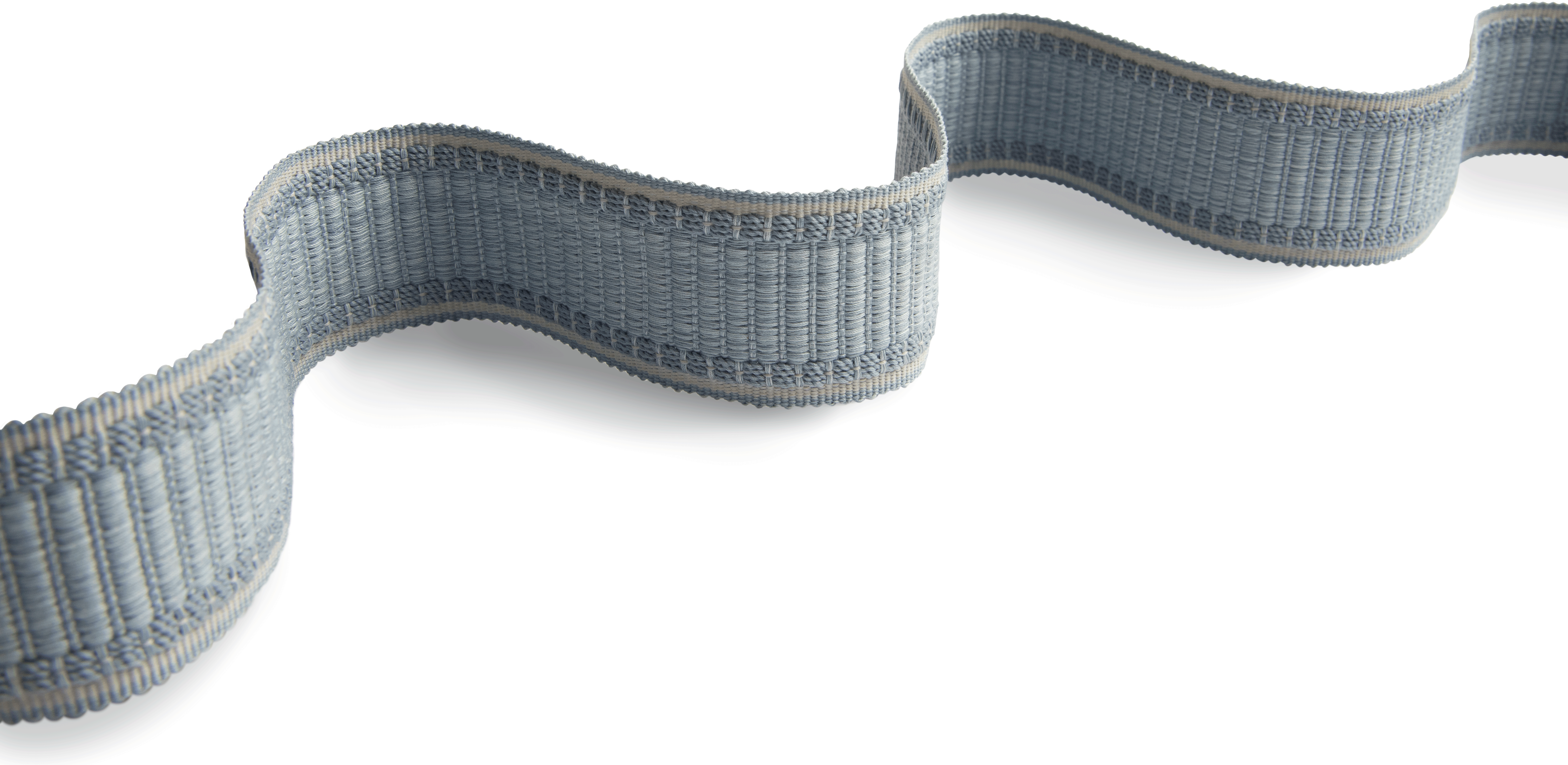
S&S: We love how you used our Lancaster Ribbed Border in your executive suite. What did this extra layer add to the overall design?
CDJ: The Lancaster Ribbed Border was the bow that visually tied my executive suite together. It's a rather bold layer because of the high color contrast value between it and the silk moire wallcovering, but it unifies many of the other furnishings' fabrics and oriental rug in the room.
S&S: What do you want clients to take away after leaving your office? How do you want them to feel?
CDJ: Our Firm's studios make a statement: they tell visitors that we've set very high standards and expectations for ourselves as a company. So, we want our clients to leave our atelier feeling refreshed, inspired, and confident in what we can create for them.

S&S: What is one tip you can share for designers looking to add more trim to their work?
CDJ: Trim is not only for window treatments or pillows. Get creative with it and think outside the box. It’s possible to pack *too much* passementerie into a single room, but it’s impossible to have too much GREAT passementerie. So choose wisely, thoughtfully, and boldly.

Interior Design: Corey Damen Jenkins
Photography: Andrew Frasz
Subscribe to our newsletter to be the first to join us as we unlock the door to our latest collaboration on January 17th.