Our Paris showroom will be closed for summer holidays from August 3 through August 14, 2026
Our Paris showroom will be closed for summer holidays from August 3 through August 14, 2026
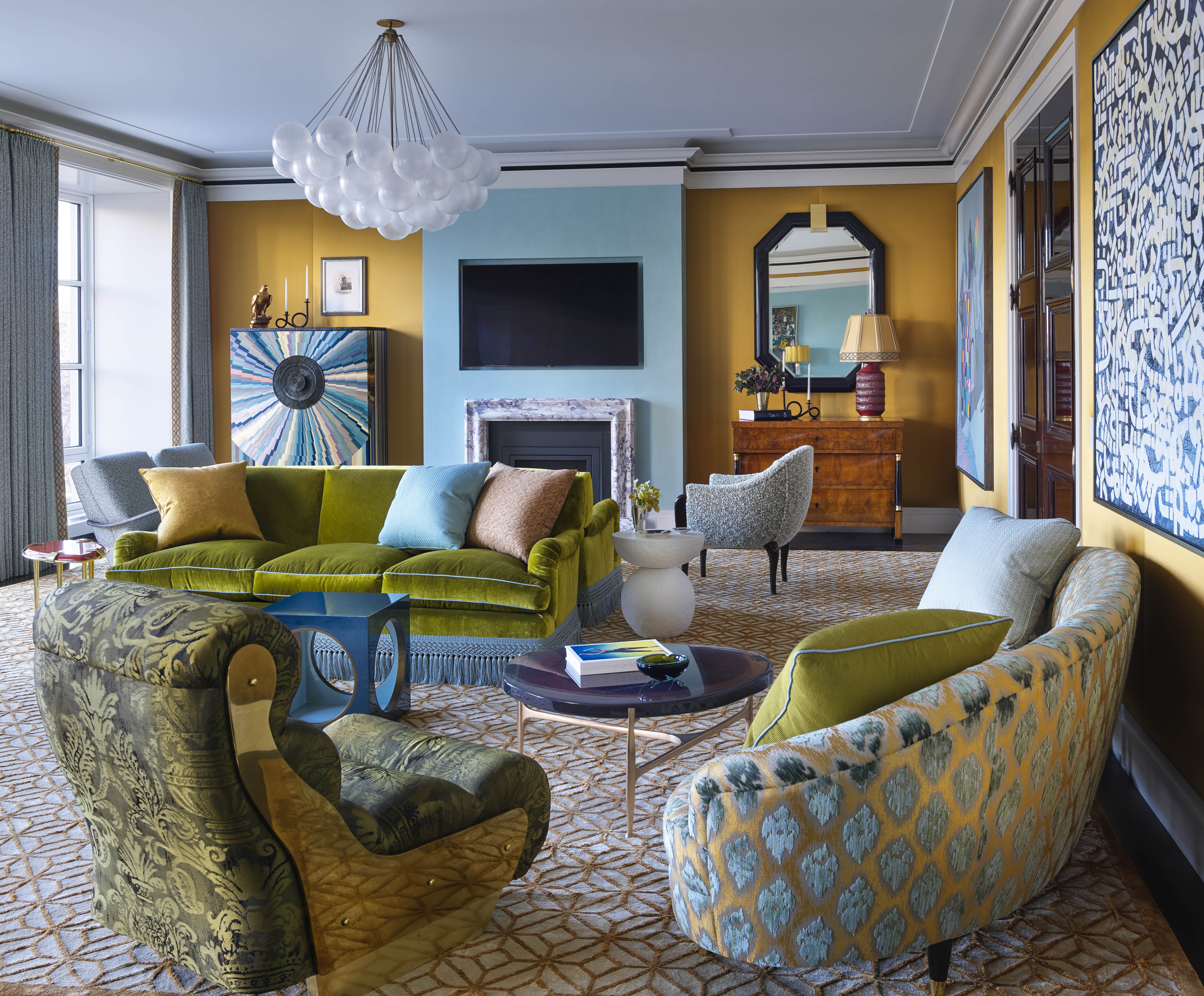
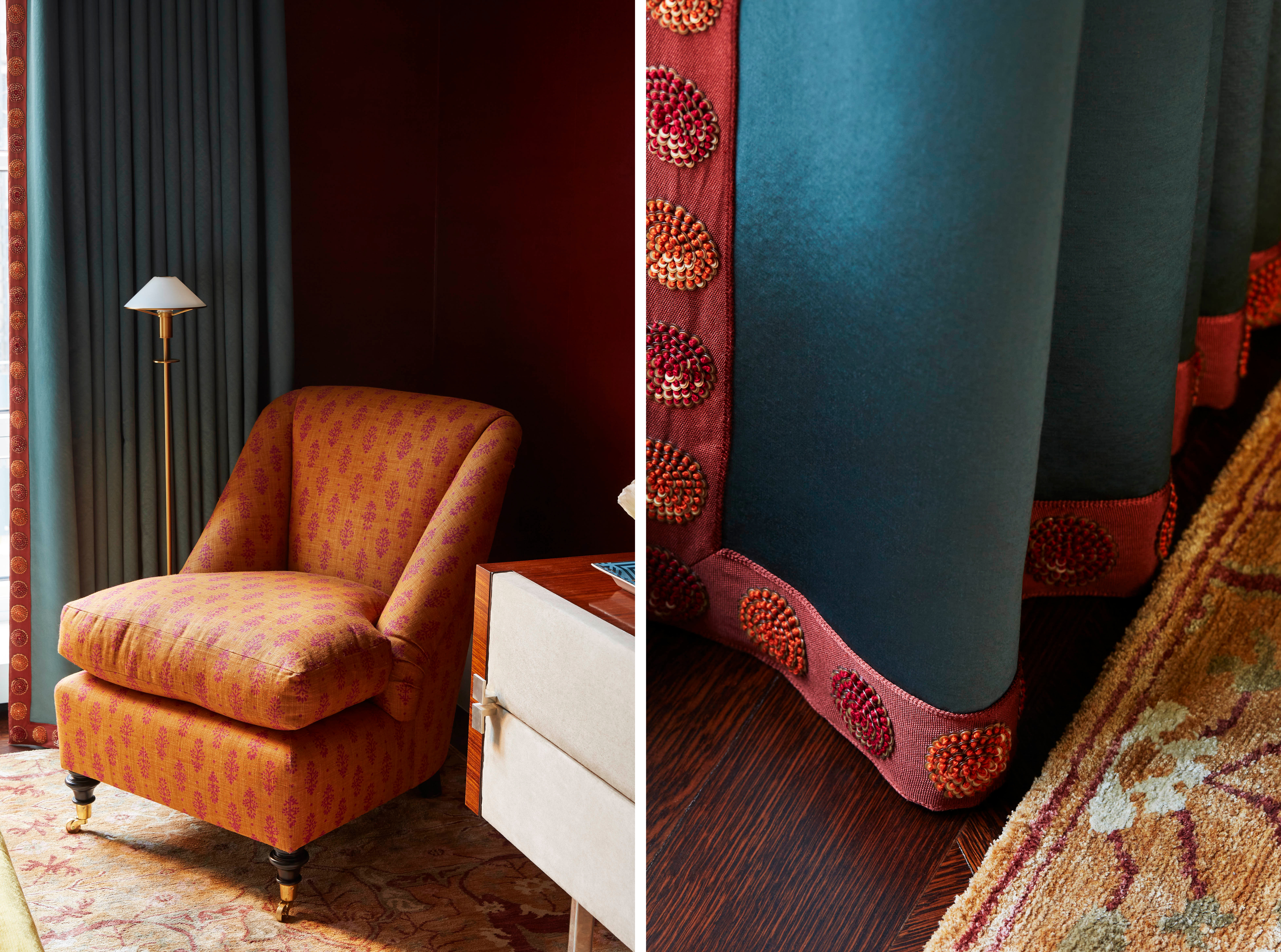
Los Angeles-based designer Kevin Isbell opens the door on a bold apartment overlooking Central Park in NYC. We spoke with him about his inspiration, his favorite colors, and how to make trim feel at home in contemporary projects.
 (2500 x 3200 px) (1).png) Samuel & Sons: Let’s set the scene — tell us about this incredible project.
Samuel & Sons: Let’s set the scene — tell us about this incredible project.
Kevin Isbell: This pied-à-terre for an international family was truly a labor of love for me. The family wanted a sophisticated yet approachable space that would reflect their dynamic lifestyle and the energy of the city. I wanted the apartment to feel as though it belonged to the city itself — but with a sense of calm that offered an escape from the hustle of the city.
S&S: You’ve worked on interiors across the world, from California to the Caribbean. How did this apartment’s iconic location on Central Park South in New York City inform your design
KI: The views of Central Park are right out your window, so I made sure to draw inspiration from the greens, blues, and warm earth tones you see throughout the seasons. But at the same time, I wanted to reflect the family's international sensibility. Their travels and multicultural background became integral to the narrative of the space. This meant incorporating a balance of bold design choices and subtle, timeless elements that would keep the space feeling fresh and layered over time.
S&S: Bold color is undeniably a hallmark of your work, yet your interiors maintain an effortless livability. How do you strike that balance?
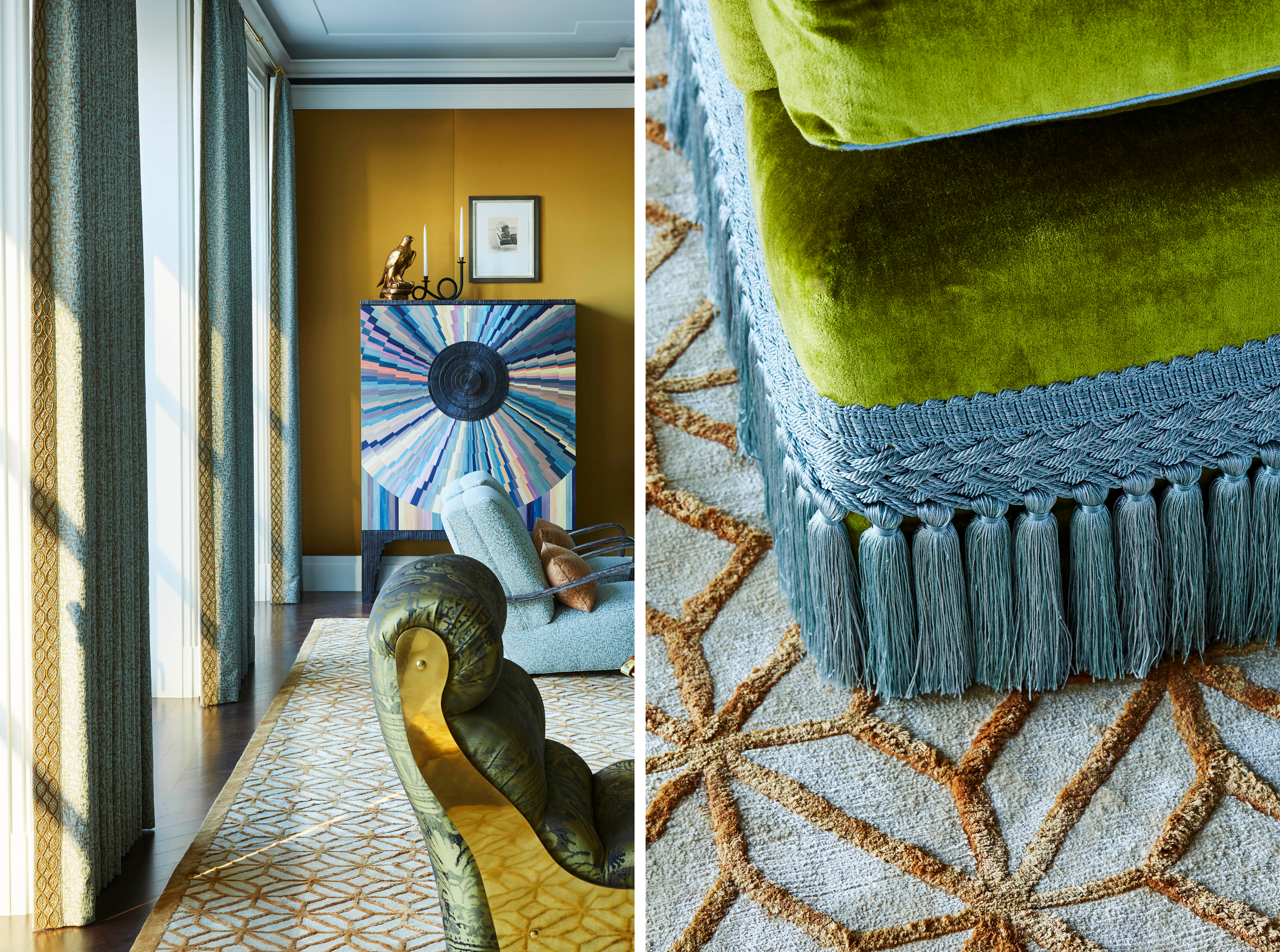
KI: Color is definitely something I love to work with, but for me it’s never just about making a statement for the sake of it. It’s about creating a balance that feels both exciting and livable but also honoring the architecture and its location. When I use strong colors, I’m very intentional about how they interact with the rest of the space. The key is layering—layering textures, patterns, and tones so that the colors feel integrated and not overwhelming. It’s the subtle variations of the color that give a room depth, far more than had the room been dipped in the same hue throughout.
 (8).png) S&S: What’s one “rule” you think every interior designer should break at least once?
S&S: What’s one “rule” you think every interior designer should break at least once?
KI: One “rule” I think every designer should break, — and I blame Instagram for this one — is the idea that everything needs to feel perfectly coordinated. When a space is too perfectly matched, it can lose some of its soul. It’s those unexpected pairings — the mix of patterns, styles, or textures — that give a room character and make it feel truly lived-in.
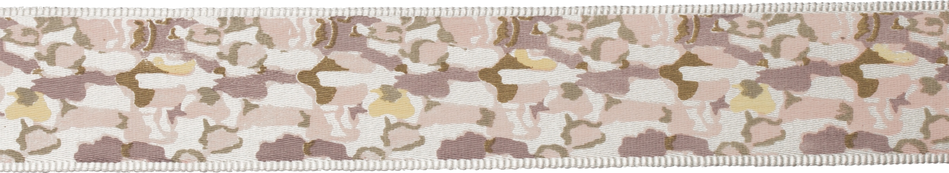
S&S: Your use of trimming feels very fresh and contemporary. What advice would you have for a designer who’s hesitant to use trims because they think it may look too formal or old-fashioned?
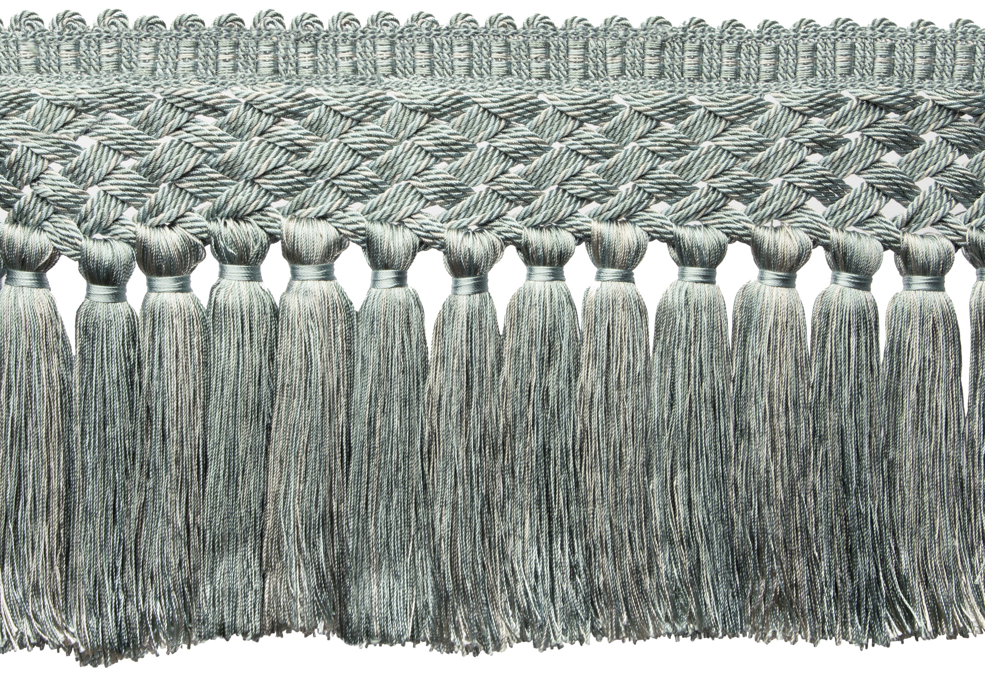
KI: Trims can definitely have a reputation for feeling overly formal or old-fashioned, but that really depends on how you use them. My advice is to think of trim not as a traditional decorative element, but as an opportunity to add a subtle layer of detail or contrast. It’s really about using it in a fresh, intentional way that enhances the overall design without making it feel fussy. At the end of the day, trim is just another tool to add depth and personality to a space. Don’t be afraid to experiment with it. When done thoughtfully, [trim] can actually make a space feel more current and tailored, rather than old-fashioned. It’s about finding the right balance and using it in a way that complements the elements of the room.
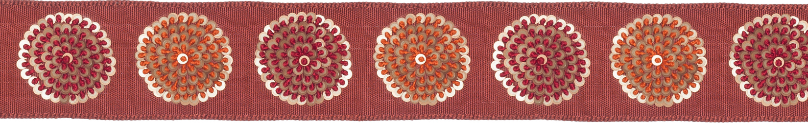
 (2500 x 3200 px).png) S&S: Which trim do you always find yourself turning to?
S&S: Which trim do you always find yourself turning to?
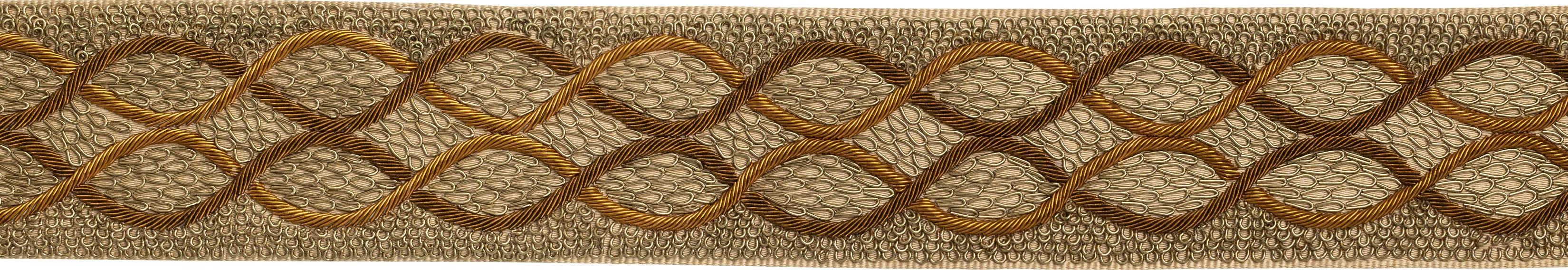
KI: I do love a good tape—it’s my go-to because it adds such a clean, finished look to just about anything. There’s something about the simplicity and versatility of styles that I find really appealing. Whether it’s on curtains, pillows, or furniture, tapes can create a strong, graphic edge that feels modern but still has that subtle hint of sophistication.
S&S: If you could only use one color combination for the rest of your career, which two colors would you be and why?
KI: Oh, that’s a tough one! If I were forced to pick, I’d have to go with blue and green. There's just something timeless and versatile about that combination—they both come from nature, so they have this innate sense of calm and balance, but depending on the shades, they can also be bold and unexpected… But ask me again tomorrow, and I might pick something completely different—color is just too much fun to be tied down to one combination forever!
![]()
Subscribe to our newsletter to be the first to join us as we unlock the door to our latest collaboration on January 17th.


.png)
.png)
.png)
.png)